Color Pairing Tips for Beginners
Choosing the right color pairing tips can completely transform a space, outfit, or design project. Yet for beginners, color pairing often feels confusing why do some combinations look effortlessly beautiful while others feel overwhelming or mismatched? The secret lies in understanding a few simple principles that designers use every day.
Whether you’re decorating your home, refreshing a room, or experimenting with creative styling, learning how to combine colors confidently will help you create balanced, visually pleasing spaces. This beginner-friendly guide breaks down color pairing into easy steps you can apply immediately.
Why Color Pairing Matters
Color is one of the first things people notice in any environment. It affects mood, perception of space, and even energy levels. A well-paired color scheme can make a small room feel larger, a dull area feel lively, or a busy space feel calm and organized.
For example, soft neutral palettes often create relaxing environments, while bold contrasts add personality and drama. If you’ve explored ideas like
https://homedecordetail.com/colorful-home-decor-ideas/
you’ll notice how intentional color choices instantly elevate interiors.
Good color pairing isn’t about following strict rules it’s about understanding harmony and balance.
Understanding the Color Wheel (The Beginner’s Foundation)

Before pairing colors, you need a basic understanding of the color wheel. Think of it as a roadmap showing how colors relate to one another.
Primary Colors
Red, blue, and yellow are the base colors. Every other color comes from mixing these.
Secondary Colors
Orange, green, and purple are created by combining primary colors.
Tertiary Colors
These are blends of primary and secondary shades, offering more subtle variations like blue-green or red-orange.
Once you understand this structure, color pairing becomes much easier because you can predict which colors naturally work together.
The Most Beginner-Friendly Color Pairing Methods

1. Complementary Colors (High Contrast Pairing)
Complementary colors sit opposite each other on the color wheel like blue and orange or red and green.
Why it works:
The contrast creates visual excitement while maintaining balance.
Beginner tip:
Use one color as the dominant shade and the other as an accent. Too much of both can feel overwhelming.
This technique works beautifully in living spaces where you want energy and personality, similar to ideas shown in
https://homedecordetail.com/interior-design-living-room-ideas/.
2. Analogous Colors (Safe and Harmonious)
Analogous colors sit next to each other on the color wheel such as blue, blue-green, and green.
Why beginners love it:
These combinations naturally feel cohesive and calming because they share undertones.
Perfect for bedrooms or relaxation areas where softness matters. You can see calming palettes applied effectively in
https://homedecordetail.com/bedroom-color-scheme-ideas/.
3. Monochromatic Color Schemes
A monochromatic palette uses different shades, tints, and tones of one single color.
Example:
- Light blue walls
- Medium blue furniture
- Dark navy accents
This method creates an elegant, modern look without the risk of clashing colors. Minimalist interiors often rely on this approach, like those featured in
https://homedecordetail.com/minimalist-living-room-ideas/.
4. Neutral + Accent Color Strategy
If you’re unsure where to start, this is the safest method.
Step 1: Choose a neutral base
(white, beige, gray, cream, or soft brown)
Step 2: Add one bold accent color
(mustard yellow, emerald green, navy blue, or blush pink)
Neutral foundations allow accents to shine without overwhelming the space. This method works especially well in modern homes and apartments, as seen in
https://homedecordetail.com/neutral-home-decor-ideas/.
The 60–30–10 Rule (A Designer Secret)

One of the easiest ways to balance colors is the 60–30–10 rule:
- 60% — Dominant color (walls or large furniture)
- 30% — Secondary color (curtains, rugs, seating)
- 10% — Accent color (decor items, cushions, art)
This rule prevents color overload while ensuring visual interest.
For example:
- 60% warm beige
- 30% olive green
- 10% gold accents
This structure keeps beginners from accidentally overusing strong colors.
Warm vs. Cool Colors: Why Balance Matters

Colors are divided into two emotional families:
Warm Colors
Red, orange, yellow
They feel energetic, cozy, and inviting.
Cool Colors
Blue, green, purple
They feel calm, fresh, and relaxing.
A balanced room often mixes both. Too many warm tones can feel intense, while too many cool tones may feel cold or distant.
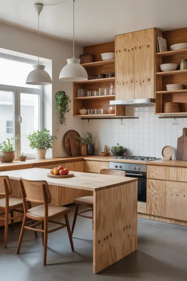
Kitchen designs often use this balance effectively warm wood tones paired with cool countertops, similar to concepts explored in
https://homedecordetail.com/interior-design-kitchen-ideas/.
How Lighting Changes Color Pairing

One of the biggest beginner mistakes is ignoring lighting.
Colors look different depending on:
- Natural daylight
- Warm artificial lighting
- Cool LED lighting
- Evening shadows
A gray wall might appear blue in daylight but beige at night.
Beginner tip:
Always test paint or fabric samples in your space before committing. Observe them at different times of the day.
Lighting guidance like this becomes especially important when planning wall treatments or paint choices, such as those discussed in
https://homedecordetail.com/home-paint-colors/.
Choosing Colors Based on Room Purpose

Color pairing should support how a space is used.
Bedrooms Calm and Comfort
Soft blues, muted greens, warm neutrals, or dusty pinks encourage relaxation. Inspiration can be found in
https://homedecordetail.com/room-color-ideas-for-the-perfect-bedroom/.
Living Rooms Balanced Energy
Combine neutrals with personality colors like terracotta, navy, or forest green.
Kitchens Clean and Fresh
White or light tones paired with wood, soft greens, or matte black accents create timeless appeal. See examples at
https://homedecordetail.com/white-kitchen-ideas/.
Bathrooms Light and Refreshing
Pair crisp whites with soft blues or sage greens to enhance cleanliness and openness.
Texture Matters as Much as Color

Many beginners think color pairing is only about shades but texture plays a huge role.
The same color looks different depending on material:
- Matte paint vs glossy finish
- Velvet vs cotton fabric
- Wood vs metal surfaces
Mixing textures adds depth even when using fewer colors. For example, a neutral room becomes visually rich when layered with woven rugs, soft cushions, and natural wood elements an approach commonly used in
https://homedecordetail.com/rustic-home-decor-ideas/.
Common Color Pairing Mistakes Beginners Make

1. Using Too Many Colors
Stick to 2–3 main colors at first.
2. Ignoring Undertones
Beige can be warm or cool. Gray can lean blue or brown. Mixing conflicting undertones creates subtle disharmony.
3. Matching Everything Exactly
Perfect matches often feel flat. Slight variation adds realism and depth.
4. Forgetting Negative Space
White or empty areas allow colors to breathe and stand out.
Easy Color Pairing Combinations That Always Work

If you want foolproof combinations, try these:
- White + Wood + Soft Green
- Beige + Terracotta + Cream
- Navy Blue + Gold + White
- Gray + Blush Pink + Black Accents
- Sage Green + Warm Brown + Off-White
These palettes work across multiple styles modern, rustic, minimalist, and contemporary.
Using Decor to Test Color Pairing Safely
Before repainting walls or buying large furniture, experiment with smaller elements:
- Throw pillows
- Curtains
- Wall art
- Rugs
- Decorative vases
This allows you to test color harmony without major commitment. DIY decor experiments like those shared in
https://homedecordetail.com/cheap-diy-home-decor-ideas/
are perfect for beginners exploring new palettes.
Seasonal Color Pairing Ideas
Changing color accents seasonally keeps your space fresh without full redesigns.
Spring
Pastels, light greens, soft yellows
Summer
Bright blues, whites, coral tones
Fall
Burnt orange, mustard, deep browns (see inspiration at https://homedecordetail.com/fall-decor-ideas-for-the-home/)
Winter
Deep blues, charcoal, metallic accents
Seasonal updates help beginners understand color interaction over time.
How to Build Confidence With Color
Color pairing improves with practice. Start small and observe what feels comfortable.
Try this beginner exercise:
- Choose one favorite color.
- Find a neutral that complements it.
- Add one contrasting accent.
- Apply the 60–30–10 rule.
Take photos of your space and analyze how colors feel visually designers often rely on photos to notice balance issues.
Final Thoughts
Learning color pairing doesn’t require artistic talent just a basic understanding of harmony, balance, and experimentation. By starting with simple techniques like complementary colors, monochromatic schemes, and neutral foundations, beginners can quickly create polished and stylish results.
Remember, great color design is less about perfection and more about intention. Observe how colors interact with light, textures, and space, and don’t be afraid to adjust along the way. Over time, your eye naturally develops a sense of what works.
With these beginner-friendly color pairing tips, you can confidently design spaces that feel cohesive, welcoming, and uniquely yours one color combination at a time.